31 August 2010

Shop: Les Indiennes


At Les Indiennes, traditional Indian textiles are re-interpreted through Western eyes to beautiful effect. Vibrant motifs are minimized to one color palette and given space on white backgrounds so that their intricacies can really be appreciated. The website provides a Flip Book of inspiration showing a range of products--upholstery fabric, cushions, wallpaper, and bedding--in a variety of settings. One of my favorites, paisley, makes frequent appearances without being overkill. The images are so inviting that they even make me rethink polka dots--a pattern I never thought I would embrace.


All images are the property of Les Indiennes by Mary Mulcahy.

22 August 2010

Film Interiors: Wimbledon


The perfect prescription for a dull Sunday afternoon, Wimbledon is the story of rising tennis star Lizzie (Kirsten Dunst) and aging player Peter (Paul Bettany) who fall in love amid the competitive atmosphere of the games. Though much of the film takes place on the court and in hotel rooms, the small glimpses that we're given into Peter's life (his apartment under renovation and his family's house) leave me wanting to see more. His childhood home in Brighton (above) is the quintessential English country house that combines formal style with a hint of messiness to keep it from being cold. 

The kitchen is clearly the heart of this house, with its large hutch full of blue and white plates. Mom Augusta arranges the day's flower pickings from the garden.

A gorgeous stone fireplace in the dining room -- the mantel covered in silver pieces and pottery.

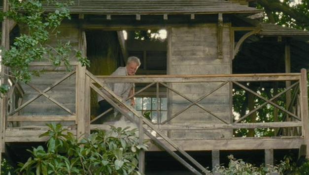
The tree house -- dad Edward's temporary living quarters.

Peter keeps an apartment in his hometown which seems to have undergone a lot of renovation and then stalled (perhaps because of a losing streak in his career). His living room and kitchen are the only finished rooms, with the rest half lived in and half in boxes.

The first shot of Peter's apartment shows that he has some great pieces to make for a cool space -- French bistro chairs, stained glass lanterns, a whitewashed dresser.

Salvaged etched glass doors and a wooden coat stand continue the French touches.

A file cabinet separates the bedroom from the living room. 

From the bedroom side, we see that the living room is one space that is no longer in transit. A cute corner cabinet and accessories -- such as the pair of vases -- make the room complete.

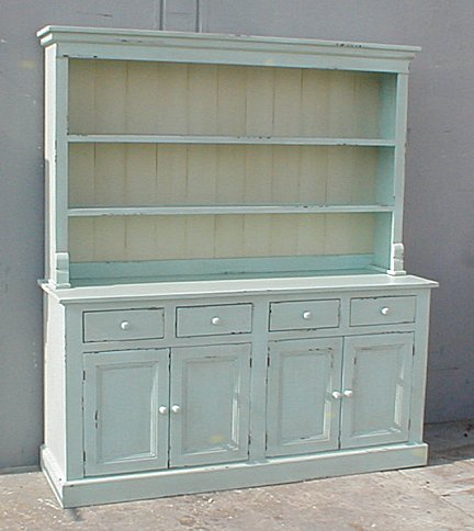
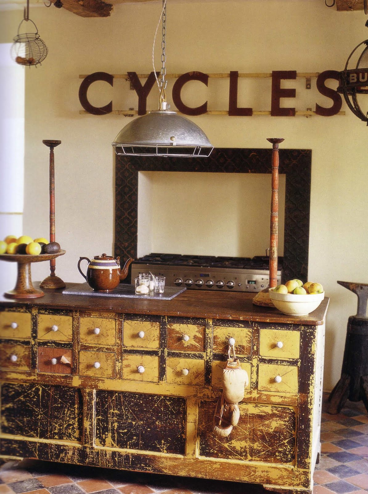
Here are a few items on the market now (though some of them are more wish-list picks than anything else) that share the essence of their inspiration pieces in Peter's apartment and in his childhood home.
The Riviera Chair from TK Collections.

A multi-colored glass lantern from Place Bellecour.

A French cartonnier or file cabinet from Olivier Fleury Inc.

A trio of bottles from New Dominion Blues.

An open hutch from Cottage Chic.

(Film Images are the property of Working Title Films. Production Designer: Brian Morris. Set Decorator: Caroline Cobbold.)

16 August 2010

Tiffany Blue


This post is inspired by the gorgeous homes featured in a blog I check out regularly--Erin Olson's House of Turquoise. Call it what you want--Tiffany blue, turquoise, aqua, robin's egg blue--it can be a soothing shade that references beach living or a vibrant shade that suits cosmopolitan living. So many of my favorite home accessories over the years have involved a variety of aqua--my headboard doors (above), a lovely lamp that I sold on etsy but nearly kept for myself, throw pillows and a pair of white cotton curtain panels with a turquoise paisley design. Paired with white, aqua can be serene and feminine. Paired with bright colors (like my current favorite--coral), it is re-invented for a new season. Like the little blue box that is synonymous with Tiffany & Co., turquoise is a gift any girl can appreciate.


A few fun etsy finds (clockwise from top left): pair of slipper chairs from Fabulous Mess, octopus pillow from Zen Threads, teal blossoms wall hook from Memory Bean Designs, vintage Russian mechanical alarm clock from Clockwork Universe, vintage linen pillow from Robin's Egg Blue, and vintage sewing machine drawer from Myra Melinda.

Images: Molly Frey DesignInside Out magazine January-February 2007 issue, House Beautiful magazine September 2010 issue, House & Home magazine August 2010 issue, and Living etc magazine May 2010 issue.

08 August 2010

Black & White


Because we moved a lot when I was growing up, the houses/apartments my family lived in were always understood to be temporary. My father wanted to keep the interiors neutral for the sake of the next owners, which meant that white walls ruled my childhood environment. Once I was out in my own space, I relished painting my walls and decorating with color. What some folks consider to be chic and elegant--an all-white house--is what I consider a decorating tool of last resort. On the other hand, dedicating one room or part of a room to a black & white scheme is another story altogether. A bedroom with white walls and linens, black painted trim and the occasional pinch of color can be extremely soothing to an over-stimulated brain. Small vignettes of black and white items strike a classic note and a bathroom with black/white checkered tile, white towels and vintage plumbing fixtures can be equally modern and retro. Old movies are not the only vehicles for cool black and white style.


Images: At Home with Country: Bringing the Comforts of Country Home by Christina Strutt, photography by Edina Van Der Wyck, publisher Cico Books 2010. Inside Out magazine January-February 2009 issue, May-June 2010 issue, May-June 2009 issue, and March-April 2009 issue. Living etc magazine, August 2009 issue.

02 August 2010

Typography


As this bronzed letter "G" that I sold on Etsy last year shows, I have a bit of a thing for typography. A single letter or number paired with art or odds and ends has no purpose other than to delight. But for that reason alone, it proves its worth. Grouped together, mismatched letters can be turned into a sign that broadcasts a passion or a room's purpose. In the same way, a phrase painted along a wall or on risers adds interest where there is otherwise just blank space. Done right, these words or phrases can add the balance of humor or gravity to a room's decor. Done poorly, they can be cheesy or sentimental. We've all seen houses whose owners were a little too familiar with the stenciling process. The following spaces are examples of what captures my attention--and not a typographical error in sight.


Images: BBC Homes & Antiques magazine, July 2010 issue. Living, Etc. magazine, February 2010 issue. Inside Out magazine, January/February 2008 issue. The Comforts of Home by Caroline Clifton-Mogg, Ryland, Peters & Small 2010. Recycled Home by Mark & Sally Bailey with photography by Debi Treloar, Ryland, Peters & Small 2009.
Related Posts with Thumbnails